Ever wonder why the deep, sophisticated black on your design file looks more like a washed-out gray on the final printed box? Or maybe you’ve lined up packages from the same batch, only to see frustrating color differences you can’t explain to your client.
The secret to solving this isn’t magic; it’s understanding CMYK. Stick with me, and I’ll show you how to get the perfect color every single time.
What is CMYK Color Model?
The CMYK color model is the standard system used in professional printing to create colors with ink on paper.
It is a subtractive model, meaning it works by subtracting (absorbing) wavelengths of light from a white background—the paper—and the color you see is the light that reflects back. This process allows printers to reproduce a vast range of colors using just four primary inks.
Here is what each letter in CMYK stands for:
- C is for Cyan: A specific shade of bright, greenish-blue.
- M is for Magenta: A rich, purplish-pink color.
- Y is for Yellow: The standard primary yellow ink.
- K is for Key (Black): The “K” stands for “Key” because in traditional printing, the black ink plate was the key plate used to add contrast, detail, and true black tones. While combining C, M, and Y can create a dark color, using a dedicated black ink produces a much deeper, more neutral, and cost-effective black.
RGB Vs CMYK Color Model & Spot Color
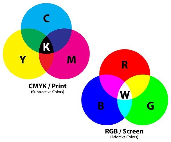
- What is RGB Color
RGB stands for Red, Green, and Blue. It is the color language of all digital screens. Monitors, phones, and cameras use this model. RGB is an additive color model.
It creates colors by adding light to a black background. Combining red, green, and blue light at full intensity creates pure white. This system produces vibrant, luminous colors.
These bright colors exist only on screen and cannot be perfectly replicated with ink.
- What is Spot Color
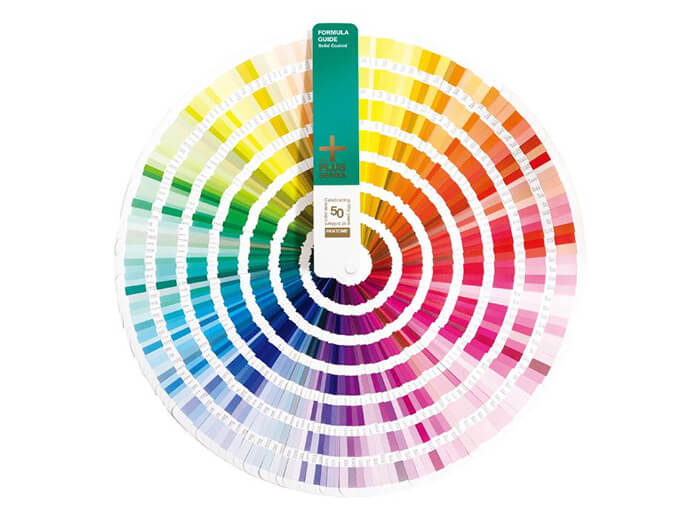
A Spot Color is a special, pre-mixed ink that is used in printing instead of being created by the CMYK process. It is a single, pure, and consistent color used to achieve absolute precision, which is especially critical for branding.
Think of the iconic red of Coca-Cola or the signature blue of Tiffany & Co.; these brands require their exact color shade to be perfect every time, on every product, anywhere in the world.
So, how does a designer in New York ensure a printer in Shanghai uses the exact same shade of blue? This is where Pantone comes in.
Pantone is not a color model like RGB or CMYK. It is a company that created the world’s most recognized color standardization system: the Pantone Matching System (PMS).
For four-color (CMYK) printing, the PANTONE Process Color System specifies 2,868 colors and shows the screen percentages for printing.
When to Use the CMYK Color Model?
Use the CMYK color model for any project destined for professional, full-color printing. It is a subtractive process that uses ink to absorb light.
- Marketing Materials: Brochures, flyers, business cards, and catalogs.
- Print Advertising: Magazine ads, newspaper ads, and billboards.
- Packaging: Most product boxes and labels that feature full-color photographs or complex graphics.
- Printed Stationery: Letterheads, envelopes, and notepads with full-color logos or imagery.
- Posters and Banners: For printed signs that require photographic reproduction.
Key Takeaway: If you are printing a design that contains full-color images or multi-color gradients, CMYK is the industry standard. Common file formats for print are PDF, AI, and EPS.
When to Use RGB
- Web Design: Websites, web banners, and all online graphics.
- Social Media: Posts, profile pictures, and cover images for platforms like Instagram, Facebook, and Twitter.
- Digital Presentations: Slides for PowerPoint, Google Slides, or Keynote.
- Video and Animation: Content for YouTube, Vimeo, television broadcasts, and motion graphics.
- App and UI/UX Design: All visual elements for mobile and desktop applications.
- Digital Photography: When editing photos that will be shared online or viewed on a screen.
Key Takeaway: If it’s not going to be physically printed, your project should be in RGB. Common file formats include JPEG, PNG, GIF, and MP4.
When to Use Spot Color (e.g., Pantone)
Use Spot Colors for projects where color accuracy is paramount, brand consistency is required, or when you need colors that CMYK cannot reproduce.
- Brand Logos: To ensure a company’s official color is perfectly consistent across all printed materials (e.g., the exact red for Coca-Cola).
- One or Two-Color Jobs: For simple designs like stationery or t-shirts, using one or two spot color inks can be more cost-effective and provide a cleaner result than CMYK.
- Specialty Inks: For colors that are impossible to create with CMYK, such as metallic (gold, silver) or fluorescent (neon) colors.
- Large, Solid Color Areas: Spot inks provide a perfectly smooth, solid, and even layer of color, avoiding the tiny dot pattern (rosette) that can be visible in CMYK prints.
- Combined with CMYK: Often, a printing job will use CMYK for photographic images and an additional spot color for the company logo on the same page to get the best of both worlds.
| Color Model | Primary Use Cases |
|---|---|
| RGB |
For all projects displayed on digital screens:
|
| CMYK |
For print projects with photos or complex, multi-color images:
|
| Spot Color (Pantone) |
For print projects demanding absolute color accuracy and consistency:
|
Key Takeaway: Use Spot Color when brand color accuracy is non-negotiable or your design requires a specific ink that is outside the CMYK spectrum.
What You Need to Know When Using CMYK Color Model
Using CMYK effectively goes far beyond simply converting your file from RGB. The final printed color is a result of a complex interaction between ink, material (substrate), and finishing processes.
To avoid costly mistakes and ensure your design intent is realized, you must master these practical considerations.
1. Understand How the Material “Transforms” Your CMYK Values
The single biggest mistake in print design is assuming CMYK colors will look the same on every surface. The material you print on is not a passive background; it actively alters the color. You must design for the material from the start.
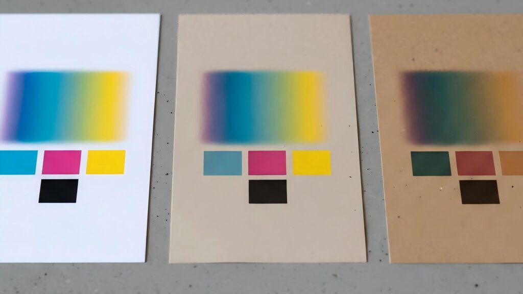
A. Paper-Based Substrates: The “Underlying Color” Trap
The base color and texture of the paper act as a built-in color filter, directly affecting how CMYK colors appear after printing.
Coated & Art Paper (Best CMYK Accuracy)
These papers have a high white point and a smooth surface, offering the most accurate CMYK color reproduction.
However, the laminate finish still matters:
- Gloss Lamination – Makes colors, especially dark tones, appear richer and more saturated.
- Matte Lamination – Can slightly dull colors, making them appear less vibrant.
A deep CMYK blue may look more subdued or slightly gray after a matte finish.
Uncoated & Kraft Paper (Base Color Changes the Rules)
These papers are naturally off-white, yellowish, or brown, which fundamentally changes CMYK behavior.
Key issues to consider:
- The “White” Problem
In CMYK, “white” is achieved by using 0% ink and revealing the paper underneath.
On kraft paper, this means any “white” area will simply appear brown. Solution: Add a Spot White Ink as a separate fifth color.
This increases cost but is often necessary for legibility and contrast. - Muted Colors
Light CMYK colors (such as sky blue or light yellow) are easily swallowed by the paper’s base color, appearing muddy or dirty.
It’s usually better to use bold, dark CMYK colors or spot colors on these substrates.
Textured Paper (Hidden Risk for Solid Colors)
The uneven surface causes ink to settle into crevices, which can disrupt color uniformity.
Common issues include:
- Blotchy or uneven large solid color areas
- Speckled or broken smooth gradients
Design tip:
For textured papers, consider using simple color blocks or replacing smooth gradients with halftone patterns.
Key Takeaway
Paper is not a neutral background.
Always design CMYK artwork with the paper’s base color, texture, and finishing process in mind—especially for kraft, uncoated, or textured substrates.
2. Ensure Compatibility with Finishing Processes
A design is rarely just CMYK printing. It often involves special finishes like foil stamping, UV coating, or embossing. Your CMYK design must accommodate these processes, not conflict with them.
A. CMYK vs. Spot Color: Know When to Surrender
Many vibrant brand colors (like Coca-Cola Red or Tiffany Blue) exist outside the gamut of what CMYK can accurately reproduce. Forcing CMYK to match them will result in a duller, less accurate version.
- The Professional Workflow: Use a Spot Color (like a Pantone ink) for the non-negotiable brand color (e.g., the logo). Use CMYK for the photographic or less critical elements of the design.
- Budget Constraints: If you must simulate a Pantone color with CMYK, get a printed proof and have the client sign off on the acceptable color variation. Use a Pantone Color Bridge guide to see the closest CMYK approximation beforehand.
B. Overprinting and Registration: The Trapping Imperative
When different colors touch, tiny misalignments during the high-speed printing process can cause ugly gaps or colored halos. This is especially true when CMYK elements interact with spot colors or text.
- The Solution is “Trapping”: To prevent this, designers intentionally create a tiny overlap between adjacent colors. For example, when printing white text on a CMYK blue background, you would make the blue “hole” slightly smaller than the white text that will be printed into it. This ensures that even with minor misalignment, no white paper is visible.
- Practical Guideline: A standard trapping value is around 0.15mm to 0.25pt. Always consult with your print provider, as their presses may have specific requirements. This is a critical step for professional-quality results.
C. Rich Black vs. Standard Black
For large, solid black areas, using only 100% Black ink (K) can result in a washed-out, grayish appearance.
- Use Rich Black: Create a deeper, more saturated black by mixing in other colors. A common formula is C:60, M:40, Y:40, K:100.
- Crucial Warning: Never use Rich Black for small text or fine lines. Any slight misregistration of the four color plates will result in fuzzy, colored edges around the text, making it hard to read. Use 100% K only for all body text and fine details.
3. Avoid Four-Color Registration for Small Elements
Using all four CMYK plates to create small text or fine lines is one of the most common and costly mistakes in print design.
Because high-speed printing can never guarantee perfect alignment (registration) of all four color plates, even tiny shifts can occur during production. This results in a blurry, fuzzy effect known as misregistration, making small elements difficult or impossible to read.
The Problem
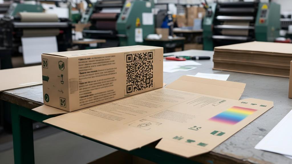
For small text (such as ingredient lists), fine borders, or QR codes, using Rich Black (a black built from C, M, Y, and K) is a recipe for disaster.
Even a microscopic shift in one color plate will create a colored halo around the text, causing it to look fuzzy, unsharp, and unprofessional.
The Professional Solution
- Small Text & Fine Lines
Always set these elements to a single ink color.
The safest and most common choice is 100% K (black ink only). If a color is required, use a two-color build (for example, C:100 + M:100 for a deep blue), which is far more stable than a four-color CMYK build. - QR Codes
QR codes must be printed in a single, solid color, preferably 100% K. Using Rich Black or any multi-color combination significantly reduces scannability, as registration errors can confuse scanning apps.
Always ensure sufficient ink density and strong contrast against the background.
Summary: The Core of CMYK Color Model in Packaging is Compromise and Balance
In the world of physical packaging, the goal of CMYK is not to perfectly replicate a digital design.
Instead, it is about finding the optimal color solution within the real-world constraints of materials, processes, cost, and function.
The ultimate objective is not 100% color accuracy, but to ensure that in the final manufactured product, the color effectively serves the core functions of the packaging: identification, user experience, and brand recognition.
Ready to Print? Let Us Handle the Technical Details.
Navigating the complexities of color modes can be challenging. Don’t worry if your designs are in RGB.
Simply send your RGB files to us. Our team of prepress experts will professionally convert them to print-ready CMYK, optimizing your colors for your chosen material and ensuring the most vibrant and accurate result possible.
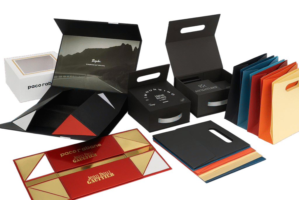
Welcome to Letai Printing. We specialize in creating high-quality, custom packaging solutions that make your brand stand out. We are proud to offer custom manufacturing for:
Contact us today to discuss your project or request a quote. We’re here to bring your vision to life.
I have honed my expertise in creating high-quality packaging solutions, bringing both innovation and efficiency to the field. I am passionate about delivering exceptional results and contributing to sustainable packaging practices.
- What is a CBD Box? The Ultimate Guide - June 9, 2026
- Bangle Box Ideas: Inspiring Designs for a Clutter-Free Space - June 8, 2026
- What is a Bangle Box? The Ultimate Guide - June 8, 2026